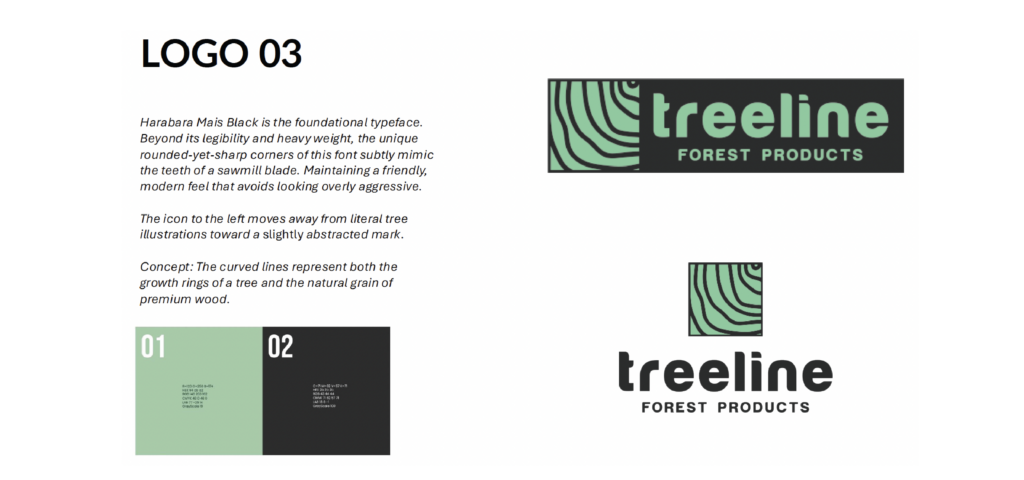
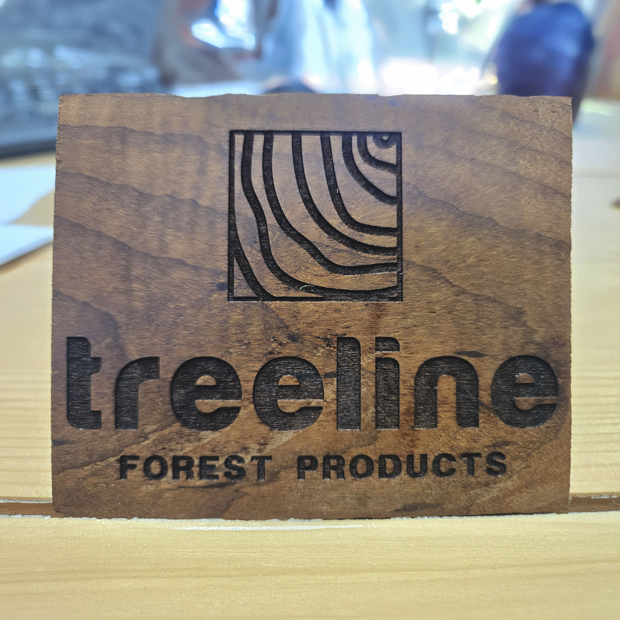
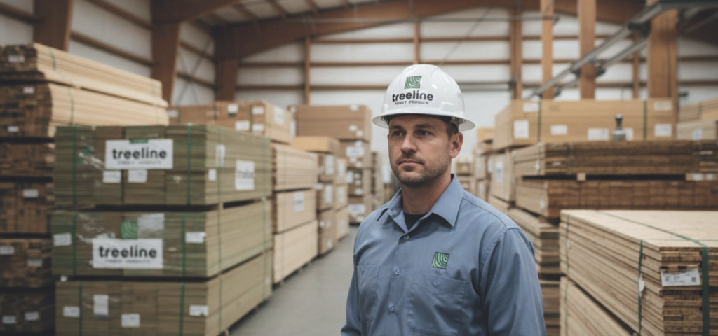
The visual identity centers on earthy, natural colors inspired by forest tones—rich greens, warm browns, and muted neutrals—which evoke the materials and environments at the core of the brand. The chosen typeface is bold yet clean, reflecting both the stability of the parent company and the modern appeal of a consumer‑facing label. The combination balances rugged authenticity with refined simplicity, supporting clear recognition across packaging, signage, and digital media.